So there’s this general trade-off that I continue to think about because I see it show up in all sorts of things, and that’s this seemingly fundamental situation where the more options a given thing has, the harder it is to be understood. The words I’ve just used in that last sentence don’t do justice to the concept, so let’s look at a few examples to elucidate the idea.
Software Stratification
One of the article topics I’ve wanted to work on is the idea of “software stratification”. I don’t know if that’s the right term for it, but it’s what I’m calling it. It’s when someone releases a VERY general library that allows its users to basically do anything they want within that domain, but because it’s so general, it’s very hard to use. The list of options within the API is so vast that most users get stuck inside the learning curve. So you end up with very few incredible power users that do awesome things with it, and a lot of people trying to use it and quitting before they get anything useful done at all.
What happens from here is some of those power users will create “abstractions” of the general library on top in order to “simplify” common uses. In the process of doing such a thing, one is forced to choose defaults on behalf of the user. In order for them to make thing simpler, they have to reduce the number of options that are available. For every option that they end up taking away in the layer above, they have to “fill in” the required option below with some choice. Their ability to do this, choosing what options to present to the user and what options to choose for them, ends up reflecting the quality of the abstraction.
An example of such a thing are two graphing libraries in python: matplotlib being the general powerful one and seaborn being the abstracted easier one. Let’s let the syntax of creating a single scatter plot with a regression line help illustrate the example. Here is the code associated with doing such a thing for both, first for matplotlib:
import matplotlib.pyplot as plt
import numpy as np
from scipy import stats
import pandas as pd
# Assuming we have data
df = pd.read_csv('data.csv')
x = df['height']
y = df['weight']
# Create the plot
fig, ax = plt.subplots(figsize=(8, 6))
# Scatter plot
ax.scatter(x, y, alpha=0.6, color='steelblue', s=50)
# Calculate and plot regression line
slope, intercept, r_value, p_value, std_err = stats.linregress(x, y)
line = slope * x + intercept
ax.plot(x, line, 'r-', linewidth=2)
# Customize appearance
ax.set_xlabel('Height', fontsize=12)
ax.set_ylabel('Weight', fontsize=12)
ax.set_title('Height vs Weight', fontsize=14)
ax.grid(True, alpha=0.3)
# Show confidence interval (requires more complex calculations)
# ... additional 10-15 lines of code for confidence bands
plt.tight_layout()
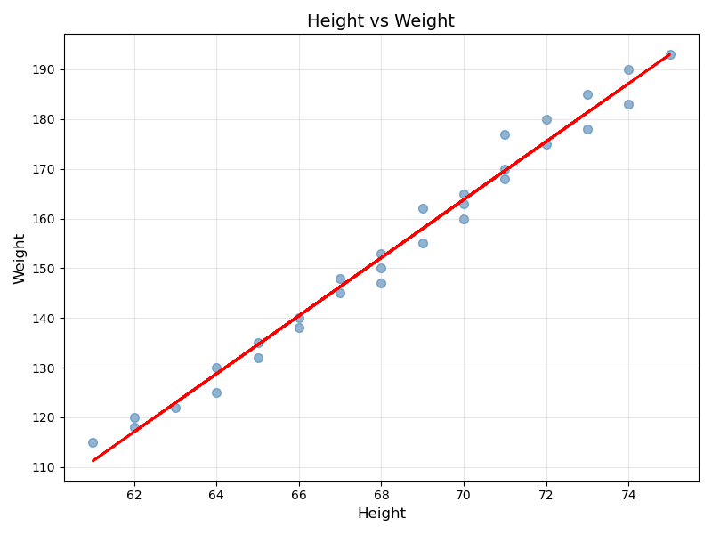
plt.show()which will yield the following image:
and now for seaborn:
import seaborn as sns
import pandas as pd

df = pd.read_csv('data.csv')

# Create the same plot
sns.regplot(data=df, x='height', y='weight')
plt.show()
which yields the following image:
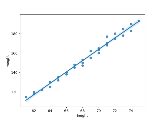
The first thing you should notice is that the amount of code you need to write to produce what is effectively the same plot is drastically different. That’s because seaborn makes many of the choices for you, thus obviating the associated code. In fact, they even added in some things that they felt were useful, like what appears to be standard deviation from the regression (look closely for the blue shading around the trend line).
There’s much to be said about how to make a “good abstraction” for users, but that is the point of another article in the future. The point here is that seaborn was created to lower the barrier of entry for users so that they can plot things without having to go through the more complicated process of learning how to use matplotlib, but by doing so, it as removed the user’s ability to fully explore what can be done with plotting in python.
They’ve constrained the user’s options for the benefit of increasing overall accessibility.
NOTE: Often called “opinionated”